Joe Sparrow / Illustrator - Animator - Designer / 07758224292 / joe@joe-sparrow.com
Showing posts with label character design. Show all posts

Friday, 18 February 2011

Design-A-Character Shape Challenge January 2011


Here's my contribution for last month's Design-A-Character challenge - basically a page on deviantart that posts little challenges for you to stretch your character design muscles. Mine are admittedly puny right now but I'm hittin' the gym so to speak!

In case ya haven't put 2 'n' 2 together yet, January's challenge was to take a series of five shapes (download them from the link above) and doodle a character fitting the outline of each one. The rules aren't strict, there aren't any prizes - it's just a little thingy to get your imagination a-flowin'.

also I have been listening to so much Groucho Marx lately it's untrue. If you read up a little on his life and maybe watch a few marx brothers movies it should give you the context to be able to get into just listening to the guy talk. he's like a verbal machinegun, even though a lot of his stuff is scripted he was obviously a super witty guy.

Monday, 15 February 2010

BEEP


Some character design sketches that I did recently for my FMP that I quite like.

Sunday, 18 October 2009

martian cyclops


Photobucket


I really enjoyed the character design project I did over the summer, but it really made me realise that I need to get better at designing/posing/rendering characters.

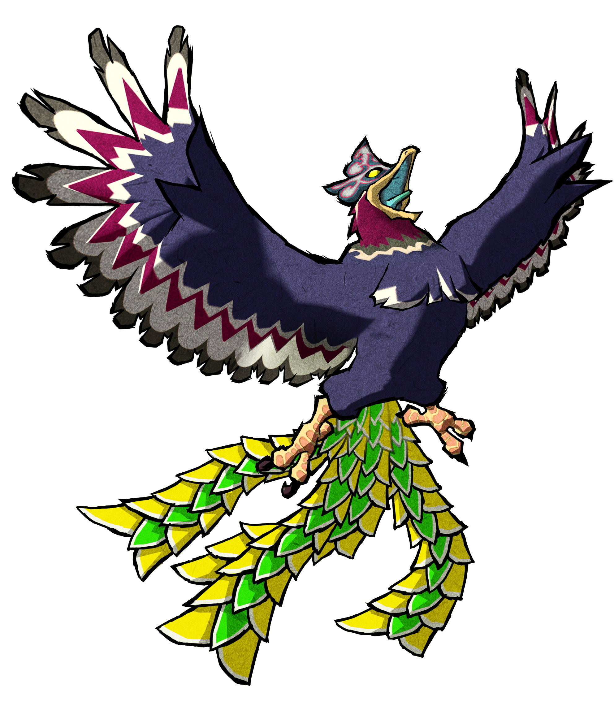
So, for the last week or so I've been trying to plan out this guy. Inspiration-wise he's sort of a cross between this wind waker enemy and Marvin the Martian.


Thursday, 1 October 2009

old character turnarounds


monster sketches


so we had the crit for the character design project and my tutors made some astute points about the development of my characters that basically explained how some of the earlier work (this and this) is a lot more interesting than the sort of more generic body shapes I ended up with later on (this sort of thing).

I initially moved away from the more abstracted square-body designs because I was worried it was constructed in a way that was more focused on style than 3-d form (and in that analysis I think I was right) but I think the way I'm developing him now it'll work pretty well.

Although I like the poses I did of the dragon-thing the overall design was always a little lacklustre, and if I changed the man I'd have to change the monster too, otherwise it'd look weird. I decided him to redesign his body shape entirely - he's gone from "horned dog-dragon" to "fanged walrus-bantha". It's sort of a knee-jerk reaction to a design I was only mildly unhappy with but I really like this big black-haired guy. Bear in mind that he's around the size of a house.

Sunday, 27 September 2009

model heads


These aren't really bang on in terms of proportion, but they give an indication of the basic mass of the head and how the skull fits. Considering I've never been good at modelling I'm quite happy with them - the one above in particular. The one below is a little crappy. But oh well.

Thursday, 10 September 2009

character development


I kind of want to save some of this for the actual project crit (some of my classmates will probably see this) but I've basically completed the character sheet for the guy and today I've been working on the monster. I'm doing the finished sheets in photoshop (I posted one of them above, the bottom image of Moroi) using vectors to get a sort of stylised, pen-drawn look. I've been watching a lot of the Clone Wars animated series lately and I'm being very inspired by it.


Tuesday, 25 August 2009

more character design

Continuing to design the main character (thinking a little more about his profession and personality now) and the creature which accompanies him.


Suggestions/favourites welcome!

Sunday, 16 August 2009

more big bird

I added the horns today, and changed some of the "cloudy" shading on the body to more "stepped" shading, (where colours go in steps from light to dark rather than gradients hitting every shade in between), because I think it matches the shading I did on the face, which I prefer.

Colours are coming along a little better. I found that this orange-ish background works pretty well to make the bird stand out all over (body stands out 'cos it's dark, head stands out 'cos it's an opposite hue - gogo complementary contrasts), although I might just try cycling the whole image hue round to see if I like an alternative pairing. It occured to me that the bird's body could be a light colour (even off-white or something) but with a dark grey or black head, maybe to indicate that the face on the bird is only a stone mask? Maybe the guy could be a sort of opposite colour, with a black coat and a head the same colour as the bird's plumage? I ought to sketch some of these out on the computer.


I did some exploring through the photoshop brushes and there's a ton of them at the bottom that are actually supposed to recreate genuine real-life brushstroke styles. I always avoided them, because they seem sort of fake-looking sometimes, but here they make the sky look a lot better than my previous attempts. Also, I changed the messed-up shading on the nose.

I'm still uploading PNGs without the "rider" layer on them because I still can't decide how to pose him on top of the bird. ;_;

Saturday, 15 August 2009

big bird WIP

Today I've been faffing in photoshop trying to do a dynamic shot of the bird and rider, trying to get a bit of that "I was made by a DeviantArt user with Photoshop" feel to it. It's harder than it looks. The sketchy drawing, as usual, has a lot more velocity to it than the later reworkings. I'm also struggling with colour in this one, I might change the colour of the "face" from light blue to something like light green in an attempt to get away from my usual tendency to stick to red/blue. finding the background difficult to introduce, too. I tried a couple of things but nothing's really impressing me yet. If anyone's familiar with this sort of art (this is probably the best example I can think of right now, done by a classmate of mine), then please feel free to suggest stuff.


Oh, also notice how I reintroduced the horns back to the design of the head, check the top drawing, you can just see them. I think it makes both his and the rider's faces just a little better.

Friday, 14 August 2009

more character design

A lot of old representations of vampires eschew the whole bat thing in favour of a more bird-themed approach - female vampires in particular seem to be often shown as harpy-like things: weird, scaly sphinx-birds that torture and kill men. I might post some of these paintings when I can be bothered.

Concentrating more on the bird-pet-thing now - the idea is that this vampire rides around on this huge, strange bird monster that who eerily resembles him - kind of a cross between the witch's bird familiar from Spirited Away and the Helmaroc King from Legend of Zelda: Wind Waker.


I'm conscious the whole idea of the face being a false mask concealing a gigantic mouth is totally ripped off from that No-Face demon in Spirited Away, too. Plus, I'm not sure how the CG guys would rig that. I imagine the feathers looking like Howl's bird form from Howl's Moving Castle, too. So much Miyazaki reference ;_; I'm not like a massive Miyazaki fan ok

Plus I think the rider still needs to be jazzed up somehow.

Thursday, 6 August 2009

character poses


I like them all except the one where he looks scared and holds his hands to his face, which could be a little more dynamic.